Real Estate
Jan 2023
A PAINLESS
PAYMENT FLOW
Payment processing is a key feature of this real estate content management platform. This project aims to simplify and consolidate all the steps the users has to go through to complete a payment for their order.
A Macbook laptop with screenshot of image from a painless payment flow
Responsibilities
bars icon
UX Research
target icon
Problem Definition
pen tool icon
IA & Wireframing
connection icon
Hi Fi Design & Prototyping
Project Requirements
Eliminate Redirects & Modals
When it came to analyzing our current payment flow, we realized that the amount of popups and redirects to Stripe/Square could be putting increased cognitive load on our users. Rather than being able to complete their payment in one go, users were forced to go through many clicks to achieve simple actions, such as adding a tip, entering a promo code, or providing their credit card details.
Maintain a uniform entry points to the payment flow
In order to make sure that all of our users have a uniform payment experience, we needed to map out all of the flows that could potentially lead to payment collection. Likewise, we had to consider all the various features that would have to be maintained with this payments redesign, namely the ability to collect full, partial, or no payment, option to pay with Apple Pay, and option to pay with saved cards or new cards. Given that certain flows would be used by different users, for instance, vendors or their customers, we needed to understand the information that will be most pertinent for them to be able to complete the payment flow.
Make this the default service provider
Before this project, we were paying more for credit card fee transactions to Stripe and/or Square. As such, we decided to develop our own processor. However, by doing so we needed to make sure that our payment processor was much better than the competition.
Research
Before working on any designs, I needed to get a better understanding of what our users need from this payment processor. First, I went through Canny posts to get insight into some of the needs that our users were voicing regarding using key words like "payments," "order placement," and "order form." To strengthen my secondary research efforts and get qualitative insights I conducted generative user interviews. I started out preparing a user interview guide that would help me in conducting interviews with users who have placed the highest amount of orders.
Notes on canvas with research insights from Dovetail
Post-Interview Analysis
After completing 10 user interviews, I analyzed these interviews in Dovetail. With this analysis, I realized that my assumptions regarding the cognitive load of the redirects, multiple modal and clicks were misguided. Most users didn't find these cumbersome and, in fact, many of them were wary of using our payment processor and didn't feel like they could trust our processor when compared with more established processors like Stripe or Square. Further, I realized that many of the benefits of Aryeo payments would actually come from adjacent technical ramifications of this processor, such as being able to process refunds internally, having the option to store and validate credit cards, being able to automatically calculate sales tax, and being able to provide invoices.
Wireframing
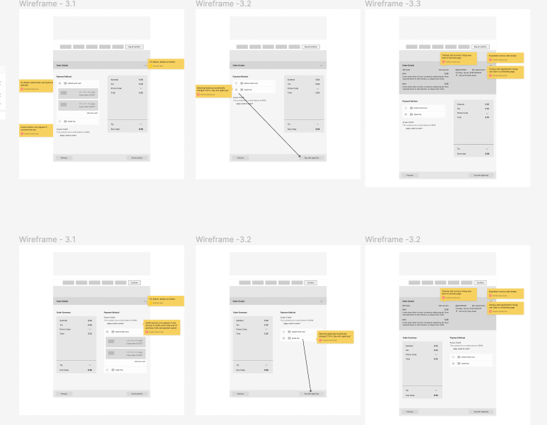
Dropdown user flow
As more stakeholders started contributing to this project, offering multiple viewpoints, there was a need to iterate several times during the course of the project. Many of these iterations consisted of small visual changes, such as defining an alternate layout and better presentation of the key functions of the page.
Hi-Fi Mockups
Flat-lay of screens from payment flow
After wireframing helped us define a layout and the best way to format and present information, I moved on to create high fidelity desktop and mobile mockups for the following user flows:
- Flow 1: full payment, saved cards, add tip, add discount, option to pay with Apple Pay, apply credit
- Flow 2: partial payment, no credit, no saved cards
- Flow 3: no payment
-Flows 4 & 5: order edit page slideover for the vendor UX and the customer UX
Prototype
Project Reflections
Insight: Having all the project stakeholders present and participating from the beginning of a project helps us avoid countless iterations.
While the design process is iterative in nature, the process can become complicated when we don't have all the necessary stakeholders participating in the project from the get go. As people join in later on in the process, it becomes harder to accommodate and implement everyone's insights. This experience has taught me to make sure that before I start any project, I should first make sure I know who the key decision makers will be on the project.
Insight: More user (usability) testing of prototypes.
‍Due to the time constraints involved in this project, we weren't able to test out our prototypes with the users. This was a critical concern of mine because many of the decisions we made during the wireframe iterations were not backed up by user research. However, thankfully, some of this user testing was accomplished through an adjacent project I did, which helped me to see more clearly the areas of improvement for this payment project.
Financial Forecast Module
arrow - right icon