Key Problems
Problem 1: Cognitive Load
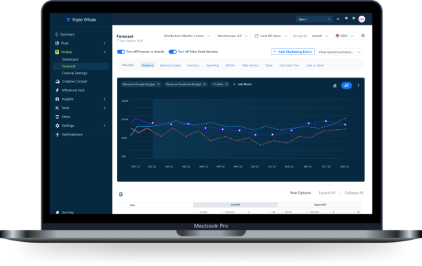
After speaking with users and showing them the prototype, we learned that many of the users found it to be very data-intensive. There was a lot of models and sub-models being shown in the data at once and parsing through so many metrics may seem daunting to users. As such, I began to think through how we can reduce the amount of content (data) on the screen and, instead, allow the user to choose which models and data they want to see.
Proposed Solution
1. Users select as many (or as few) models they want in the top "Models" bar. The models they select translate to which metrics they are able to choose to display in the graph. Again, here they can choose as many or as few as they want. In the previous iteration, they could have only selected two. This redesign allows them to visually stack and compare data points for various metrics all at once.
2. Users can drag any of the data anchor line points which gives them another option of editing their forecast. Originally, they could only do this by going into the table and changing values for projected cells. However, I realized that this approach may not be the best approach, especially for users who are more visually oriented and don't have a specific number in mind when editing projected cells.
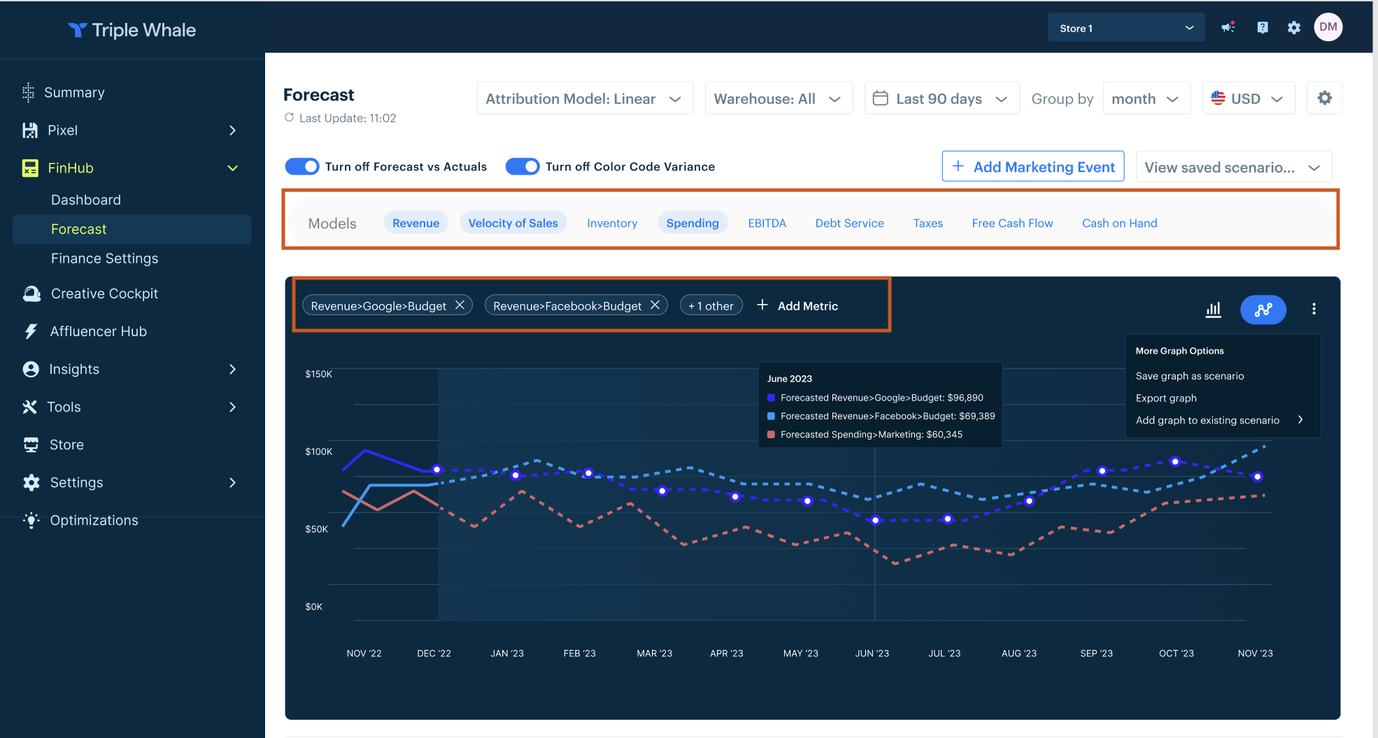
Note the model selector tab above the graph. Based on the selected models, the user can then add metrics that fall under the selected models in the ‘add metrics’ bar at the top of the graph. The table data also reflects the selection of the models.
Problem 2: Inventory Management
Another feature need that users communicated upon seeing the first design iteration concerns that of forecasting for products or SKUs that are included in a sales promotion/marketing event. Given that these sales last a defined period of time and may greatly affect stock, revenue, etc. of given products or SKUs we added an option for users to add a marketing event.
Proposed Solution
The way I tackled this is by drawing inspiration from Cogsy, an inventory management solution for ecom brands. This solution was based on users who mentioned wanting the option of manually entering a multiplier that they believed would be the impact of a marketing event affecting certain products.
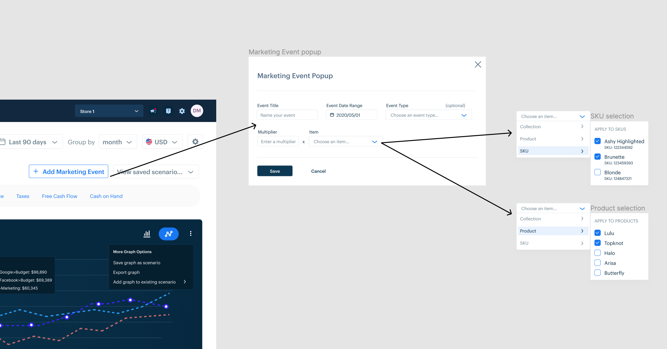
Note the "Add marketing event" CTA which opens a popup that allows users to select the event date range, event type, and the item type they want the manually inputted multiplier to pertain to.
Problem 3: Accessibility & Visual Noise
A small issue I realized about the initial design was the lack of contrast when "Color Code Variance" was toggled on. Since this feature highlighted all projected cells in either green or red (depending on whether the projection was met or not), the dark blue body text on the highlighted cell was hard to read.
Proposed Solution
Coupled with the grayish background of columns, I realized that in order to reduce the visual noise and make the design more accessible we could have a small red or green line next to projected cells when "Color Code Variance" is toggled on.

Before: colored cells hinder visibility and contribute to visual noise
After: subtle demarcation of color code variance that doesn't hinder visibility
Problem 4: Technical Constraints
Another issue that was brought to my attention by the developers on our team was that the inventory portion of the table was not technically possible. The dropdown within the inventory model and the metric selector (with arrows for the users to scroll through the various meta data metrics) could not be developed easily. As such, we decided to mitigate this problem by having the inventory model be a separate table. This gave us the space we needed to move the 'sort by' dropdown outside of the model view. While this was an easy fix, we still didn't know how best to represent the meta data that the user would be able to edit in the inventory portion (such as lead time, average daily sales velocity, etc.).
Proposed Solution
I brainstormed several solutions:
1. Moving the month columns/cells further right to give enough space for the meta data metrics to fit without the user having to scroll through them. However, we abandoned this idea as we realized the gap between the model name and the cell values would be to wide for all the other models, thus making it hard to easily see which model belonged to which line of cells.
2. Having the dates for the inventory section start further right than the rest of the models. This idea was abandoned as we realized that this option would hinder scannability of the cell data if the inventory cells and months were indented further right from the rest of the models.
3. Moving the meta data selector outside of the inventory section where the user could flip through the metrics in the column by clicking on the arrows. This idea was not pursued because it would be difficult for the user to know that the outside meta data selector related to the metric within the column. It could easily be confused with the arrows serving the function of flipping through different views of the inventory section.
4. Moving the meta data metrics after the month column metrics so that the left hand side of all the models is aligned. While this idea seemed to work well, it would necessitate extending the width of inventory model table which would throw off the balance when looking at the width of the other table with the remaining models.
5. Moving the meta data column selector outside of the table (next to the 'sort by' dropdown) and have it be selected with a radio button. While this idea seemed to work well in theory, upon mocking it up, we saw that the width of the radio group selector was further right from the meta data column that was right next to the product name/SKU which could confuse users as to which portion of the inventory section it is referring to. To fix this, we decided to show this meta data selection as another dropdown. To save more space, we moved the dropdown prompt (placeholder) text for both the sorting and meta data column selectors into the dropdowns themselves. This allowed us to align the 'sort by' dropdown with the item name and the meta data dropdown with the meta column data.

Before: technically impossible to have sort by dropdown within this table and the meta data column selector within the table

After: moved 'sort by' and meta data selection into dropdowns outside of the table left-aligned with the columns they relate to