Key Problems
Problem 1: Function Feature Display
One of the main challenges I faced in this project is clearly demonstrating to the user the function feature which would allow them to combine two metrics in creating one condition for a rule.
Proposed Solution
1. Originally, I experimented with a simple "Add function" CTA; however, this added to the already long line of text and forced wrapping of the text, which was not ideal for the devs.
2. To fix this issue, I tried making the function feature into a toggle on/off switch. This idea worked better (in terms of saving space), but it would take too much dev work. The toggle switch had the f(x) within the toggle itself which was not an element we currently had in our library.
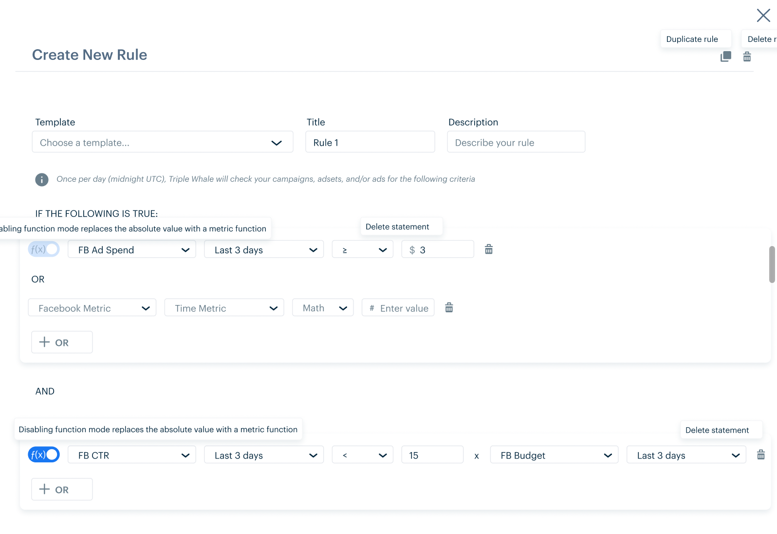
3. The third idea still maintained the toggle but put the text outside of the toggle switch. It also spelled out f(x) into function as I realized not everyone would immediately know what this math symbol means. This was ultimately the approach we went with because it saved the devs time and enabled devs to reuse a component they'd already built.

Option 1: using a standard button to enable function mode
Option 2: using a toggle switch with the custom 'f(x)' within the switch

Option 3: using a standard toggle switch with disable or enable formula mode outside of the switch
Problem 2: Metrics by Level
When thinking through the required content in the modal, we realized that each side of the formula equation could pertain to metrics on the account, campaign, adset, or ad level. However, rather than adding two more dropdowns to the already dropdown-heavy condition statement, we decided to combine the two.
Proposed Solution
1. Originally, I thought of using a cascading dropdown where the user would choose the level first and then see the metrics available for that level. However, given dev constraints and the lack of such a component in our library I had to think of an alternative solution.
2. The second approach was having the dropdown be type-enabled so that the user could easily type in a metric and then see the various levels it was available under. While this option worked if we assumed the user would type in the metric, this wasn't taking into consideration if the user typed in a level or if they simply opened the dropdown without typing anything. To capture this user case, we'd show them the heading of the level they've typed in and/or all of the metrics that are available under the level(s). While this would result in a lengthy dropdown, due to time constraints, we went with this option. In further iterations, I would hide the metrics on default until the user opens up a given level by clicking on a dropdown arrow to reveal all metrics pertaining to it.
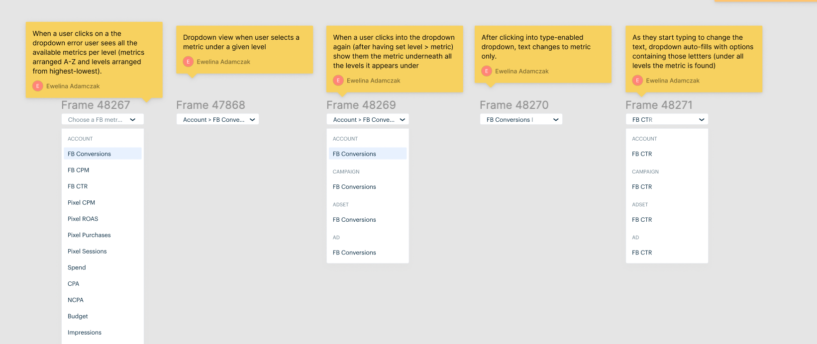
Dropdown user flow
Problem 3: Mobile Responsiveness
Even though most of our users access our dashboard via a desktop screen, we still wanted to ensure that the mobile version was optimized for users who would be creating rules on their phones.
Proposed Solution
I realized that given the reduced real estate on a phone screen, we'd have to break up the conditions into several lines in order to avoid having to fit too many dropdowns in one row with too little spacing in between them which could potentially make users accidentally click on the wrong dropdown. Knowing this, I still wanted the users to understand that even though the condition would be several lines long on mobile, it would still be one condition. To convey this, I put each condition within a set card (with a gentle drop shadow) to signal to the user that all lines belonged to one group. Each rule would also be a card as well, with the conditions as cards within that rule.
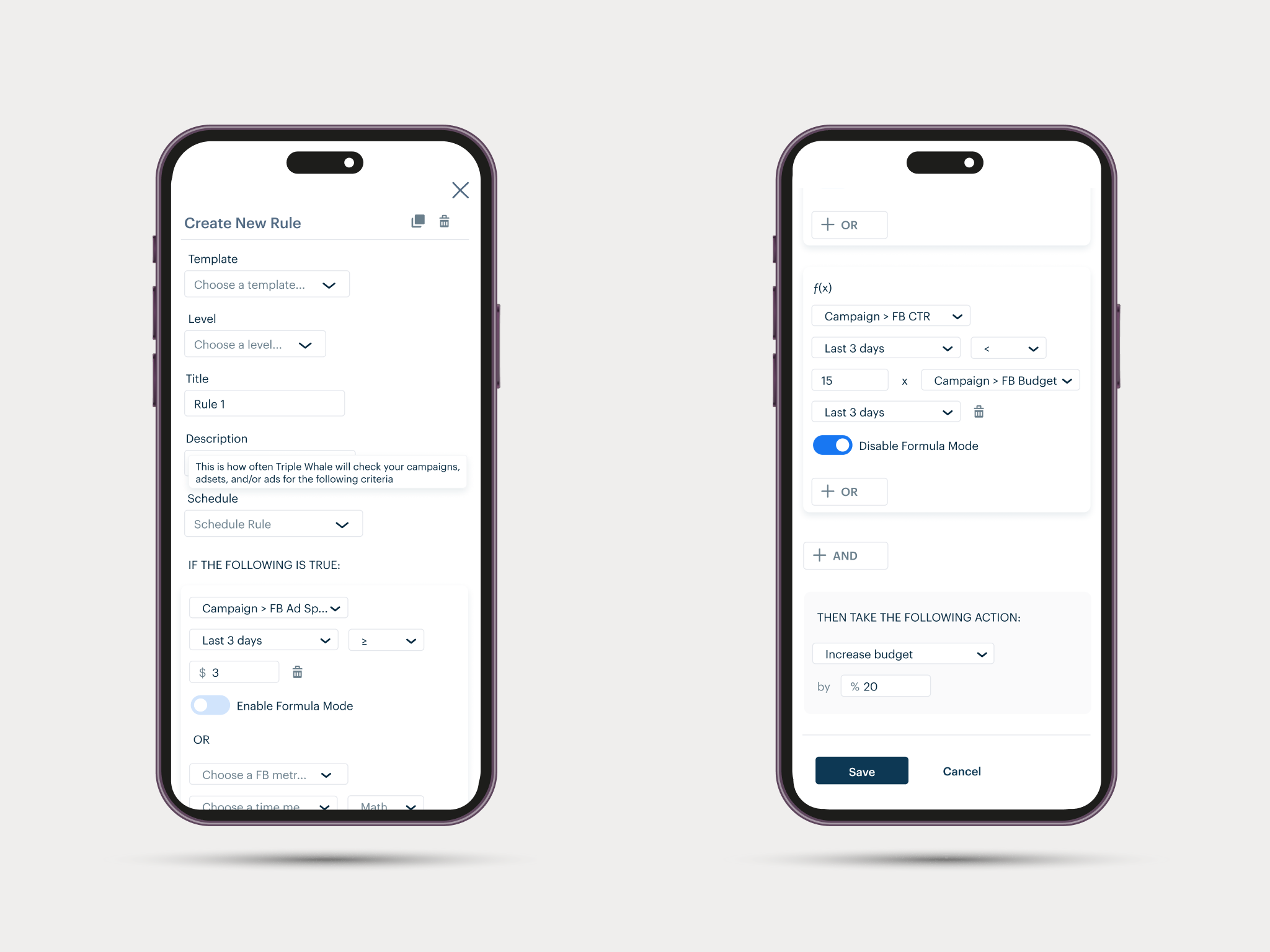
Mobile responsive version
